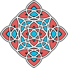
This post is a tutorial for turning a simple circle into this awesome pattern:
 If you can draw a circle in illustrator, I promise you that, by the end of this tutorial you will be making stuff like this without breaking a sweat.
The key players are the 'fleurify' button from my organify2 panel, and the 'mirror angles' button from my new ArcTwister panel. If you have these installed, lets get going. If not, you should be able to get them both from the 'Javascript Flash Panel' links on the side of this blog.
OK, let's get to it then shall we?
Step 1: First, start illustrator CS3 and create a blank document. Use the draw ellipse icon on the tool palate to draw a circle. You can use any rounded shape you want, but this one was done with a perfect circle. Now assuming my aforementioned panels are downloaded, drop the swf files into your scripts folder (see included read me in the zip files for detailed instructions) and double click on both jsx files to bring up the new palates.
Step 2: Select your circle and click the 'fleurify' icon on my organify2 flash panel. You will have to adjust the numbers a bit to get the shape right (see below) but I think the right number is close to 100.
You can also make minor adjustments to the angles of the curves by clicking the 'mirror angles' button on my ArcTwister and moving the top slider a few pixels to beef it up a bit. Experiment with both sliders and see what it does to the shape. Use small increments at first... Remember, if it gets too out of control you can always re-fleurify your object to restart at the beginning of step 2.

Step 2.5:
(This one isn't illustrated, but there is no visual change.)
Use the 'Divide' tool located on Illustrators 'Pathfinder' palate to break the shape apart. When this is done your art wont look any different, but you will have broken your single shape into 9 individual objects. You will need to ungroup (control+shift+'g') the divided objects now before proceeding on to step 3. You may have to click on the group first to get focus if you've been playing with the swf palates.
Step 3: Now select all your new objects and run 'fleurify' again.
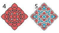
Step 4: Use ArcTwisters 'mirror angles' to adjust for aesthetics. I adjusted the triangles separately to get everything to look uniform.
Step 5: Ready for the magic? Regroup everything and remove fill and stroke.
 Now when you apply a style to the group, the separate objects are visibly merged. Open your appearance palate; it should show that your object currently has no stroke or fill, so add some.
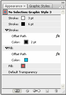
Use the flyout menu on the upper right of the palate to add new fills and strokes to the group object, or you can just duplicate your existing (empty) fills and strokes. Make sure the heavier weight strokes are behind the thin ones or the thin ones wont show up.
 You can easily create your own style this way, but here is a screen shot of my appearance palate if you wish to recreate the style for this tutorial.
If you want to be lazy about it, (as I sometimes can be) you can just download it here with a couple other neat styles I made, but I encourage you to make it yourself so you know what's going on.
What you see on screen should closely resemble the image at the top of this post. If so, my work here is done. Now repeat the process with a hexagon and see what you end up with. :)
If you're still reading, then you have reached the end of this tutorial, hopefully you're not sweating too profusely yet. I hope this tute has been helpful and has provided you with a few ideas to play with. The palates have lots of other neat buttons to press, so go see what happens next, and, as always, have fun!
cheers,
-J


No comments:
Post a Comment